U.S. Spread of COVID-19 Maps and Analytics
Site Decommission Effective February 28, 2023
Given COVID-19 has evolved from pandemic to something which is now handled as matter of course by the medical community, it is the intention of SharedGeo to decommission this site and archive data contained herein effective February 28, 2023. If you have need of the information that was provided here, please send a note to info@sharedgeo.org.
Update Notes:
- January 6, 2021: A CONUS 14-Day Lag Map has been added to the "Active Cases" section.
- November 18, 2020: This site now features an opening section with graphs focusing on the 2nd wave outbreak starting November 2020. Maps and analytics from March 2020 forward can be found below these graphs.
- November 17, 2020: AAA COVID-19 Travel Restrictions Map has replaced the previous Wikimedia map of restrictions. The AAA map updates as restrictions on travel, business hours, and social gatherings are added or removed. Find it on the Other Situational Awareness (SA) Platforms page.
- June 5, 2020: There is a COVID-19 Data Lesson Plan Package available for 8-10th grade students using data from this site. Click here: COVID-19 Data Lesson.
Active Cases
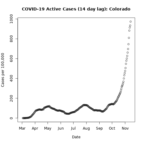
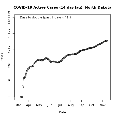
Which states are dealing with increasing numbers of new cases? These graphs show updated "Active Cases" (total confirmed in the last 14 days), which estimates the minimum number of people that should be in quarantine. The focus on recent cases removes influence of outbreaks several months ago and makes it easier to see current conditions.
- Each individual graph shows the new "Active Cases" (total confirmed in the last 14 days) each day since early March 2020.
- In the first set (left graph), the "Active Cases" total is divided by the state population. This shows the number of active cases per 100,000 people. If "Active Cases" reaches 1000, then at least 1 of every 100 people has an "Active" case and should be in quarantine.
- These graphs are a regular linear scale, so exponential growth will show as a rapid rise in the case totals curve. The maximum on each scale varies by state so that patterns are visible for all.
- In the second set (right graph), the "Active Cases" scale is shown as powers of 10 (logarithmic), so exploding exponential growth would look like a straight line (10->100->1000) going up to the right. If the number of "Active Cases" is about the same each day (not growing), the line will look flat (horizontal).
- The "Days to Double" value in the second set is calculated by a fitting a line to the last 7 days of these totals (least-squares analysis). If the days to double is short, the new active cases are increasing rapidly. A longer days to double shows infections are still increasing but more slowly.
- See notes in the "About" (bottom) section of this website for information on data sources.
The new "Active Cases" graphs for all states and territories, plus for the U.S. as a whole, are shown by hitting one of the links below. Additionally, a link to a map showing 14-day lag in CONUS only has also been provided.
By County, Time-Lapse Spread of COVID-19 Map (Cumulative)
Click on controlbar arrow to play as a time-lapse view.
View shown uses end of day reported numbers. Consequently, display date and info will advance with the 1 pm ET update on the day that follows.
Due to data availability issues and relatively small size, visualization of circumstances in Puerto Rico, Guam and U.S. island terrirories are shown only in the "Flattening the Curve Graphs" below.
By County, Time-Lapse Spread of COVID-19 Map (per 100,000)
In contrast to the cumulative confirmed cases map above, the below map shows the U.S. spread of COVID-19 as a function of cases per 100,000 residents in each county.
- The cumulative confirmed cases map works well for showing where the most cases are, but over time will tend to show difference in human population rather than difference in virus activity.
- The per 100,000 map below shows the cumulative number of reported cases of COVID-19, as a proportion of county population. This highlights areas with high intensity of infection.
- If a county shows 1000 cases per 100,000 people, that suggests 1% of the population has had a confirmed case. This assumes cases reported in a county are from residents of that county.
- See notes in the "About" (bottom) section of this website for information on data sources.
Click on controlbar arrow to play as a time-lapse view.
View shown uses end of day reported numbers. Consequently, display date and info will advance with the 1 pm ET update on the day that follows.
Due to data availability issues and relatively small size, visualization of circumstances in Puerto Rico, Guam and U.S. island territories are shown only in the "Flattening the Curve Graphs" below.
Flattening the Curve Map
How are states doing at "Flattening the Curve"? The map below provides an ongoing estimate of "Flatness" based on the change in cumulative confirmed cases in the last 7 days.
- States where confirmed cases are increasing rapidly are brighter red. A value of 1.4 days to double is extremely fast growth.
- When confirmed cases are first found in a state, the rate of increase can be fast, even if the total number of known cases is still small.
- 7 days or more to double shows growth is more controlled.
- When new confirmed cases start declining, the state color value will increasingly move toward white - with pure white representing a flattened curve for that state.
- Due to data availability issues and relatively small size, visualization of circumstances in Puerto Rico, Guam and U.S. island territories are shown only in the "Flattening the Curve Graphs" below.
Click on controlbar arrow to play as a time-lapse view.
View shown uses end of day reported numbers. Consequently, display date and info will advance with the 1 pm ET update on the day that follows.
Due to data availability issues and relatively small size, visualization of circumstances in Puerto Rico, Guam and U.S. island territories are shown only in the "Flattening the Curve Graphs" below.
Flattening the Curve Graphs
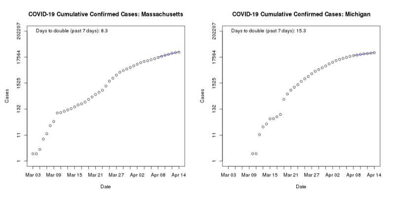
The “Curve” data graph for each state or territory is shown by using either of the first two links above. The top link will load all graphs in one view, the next link will open a page where a specific state or territory may be selected. The bottom link shows the aggregate performance for the entire United States.
- Each individual graph shows the cumulative confirmed cases each day since early March.
- The scale goes up by powers of 10 (logarithmic), so exploding exponential growth would look like a straight line on this graph (10->100->1000).
- The blue line on each graph shows the 7-day growth rate fitted to the actual case data for each state.
- If the blue line goes up steeply, cumulative confirmed cases are expanding very rapidly.
- The closer the blue line is to horizontal, the more the rate of growth has slowed.
- When the blue line is flat (horizontal), it shows there were about the same number of cumulative cases for 7 days.
- See notes in the "About" (bottom) section of this website for information on data sources.
Flattening the Curve Comparative Table
(Table works in Chrome, Safari, Edge and FireFox. Will not open in IE11)
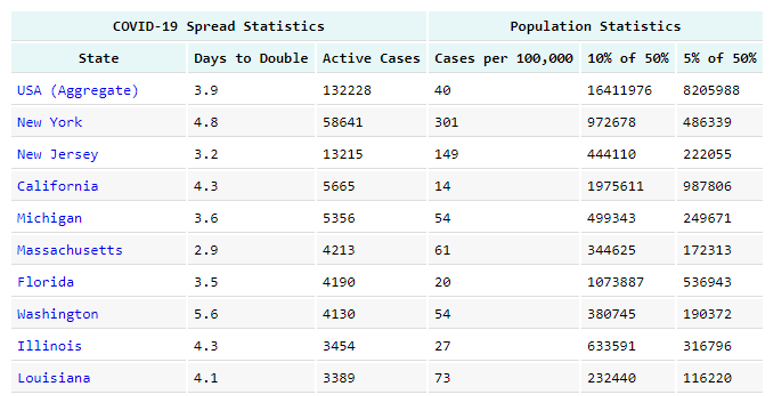
The comparative table allows a user to sort U.S. cumulative confirmed case data by clicking the various column headers to determine:
- States and territories with the fastest and slowest rates of the COVID-19 virus expansion. This calculation - Days to Double - is derived from the 7-day growth rate fitted to the cumulative confirmed case data for each locale.
- States and territories with the highest and lowest number of cumulative confirmed cases.
- A rough estimate of the impact on states and territories can be made by comparing numbers across the table.
- Because hospitalization and need of ICU care is highly varible across age groups, the Population Statistics portion of the table uses the following assumptions: 50% of any given population will get COVID-19, 10% of those sick will require hospitalization, 5% of those sick will require ICU care.
- Variations in state active case count numbers shown on the table and those reported by state health organiztions are normally a function of time of day of those state reports and the time when the table was last generated.
- See notes below for information on data sources.
About These Maps and Related Analytics:
- SharedGeo created these maps and related analytics to visually demonstrate to U.S. citizens the rapidly expanding nature of the COVID-19 virus crisis in the U.S. so individuals and organizations will take to heart the warnings, precautions, and preventive measures requested by the Centers for Disease Control and Prevention and others in the medical and Public Health sectors.
- This site is provided for academic, research and informational purposes, and we provide no warranties, claims, or representations regarding these data sets or their uses.
- Maps and graphics found on this website may be inserted into news and other informational websites by using the appropriate "Expanded Display" URL in an iframe. Acknowledgement of SharedGeo is appreciated.
- Over the course of the pandemic we have used data from a variety of sources including the University of Virginia Biocomplexity Institute's COVID-19 Surveillance Dashboard http://nssac.bii.virginia.edu/covid-19/dashboard/, the Coronavirus COVID-19 Global Cases by the Center for Systems Science and Engineering (CSSE) at Johns Hopkins University, The New York Times, and 1Point3Acres.com. The maps and graphs are currently displaying data from the New York Times county-level data set, based on reports from state and local health agencies.
- For more information on the data set used to generate the "per 100,000" map, please see New York Times methodology description https://github.com/nytimes/covid-19-data/blob/master/README.md
- In all cases data is provided under a CC BY-NC license. For more information see https://nssac.github.io/covid-19/dashboard/ and https://github.com/nytimes/covid-19-data/blob/master/LICENSE.
- Data will occasionally be unavailable for a few counties on each day as the dates advance. Although this will falsely generate the impression case numbers decreased on those days for those counties, the general sense of the pandemic's advancement across the United States remains valid.
- County level data is the best currently available. However, concepts shown could be used to provide much better visualization of developments if Departments of Health/Public Heath organizations would make their data available by census blocks or similar level of granularity. Indeed, there are effective ways to provide specific location information of medically related data without violating patient privacy. For an example, see https://usng-gis.org/.
- Assumptions used in the "Flattening the Curve Comparative Table" were bench-marked for reasonableness against multiple sources to include CDC data as reported by Dylan Scott, for Vox.com on March 23, 2020.
- SharedGeo will continually update the maps and related analytics as source data is refreshed.
About SharedGeo: Founded in 2008, SharedGeo is a 501(c)3 Minnesota based nonprofit with the mission of helping government, nonprofit, education, and corporate entities use mapping technologies and share geographic data for the public good.
Our products and efforts span:
- automatic vehicle location tracking,
- petascale computing,
- First Responder products and training,
- environmental change monitoring,
- disaster response,
- U.S. National Grid support,
- geospatial community events and association management,
- Free and Open Source Software for Geospatial software development, and
- creation of unique and affordable approaches to the nation's most difficult geospatial challenges.
Learn more: www.sharedgeo.org
Project Press Releases
SharedGeo
1360 University Ave. West
Suite 455
St. Paul, MN 55104
888-877-SGEO (7436)
"Collaborative Mapping Services"


